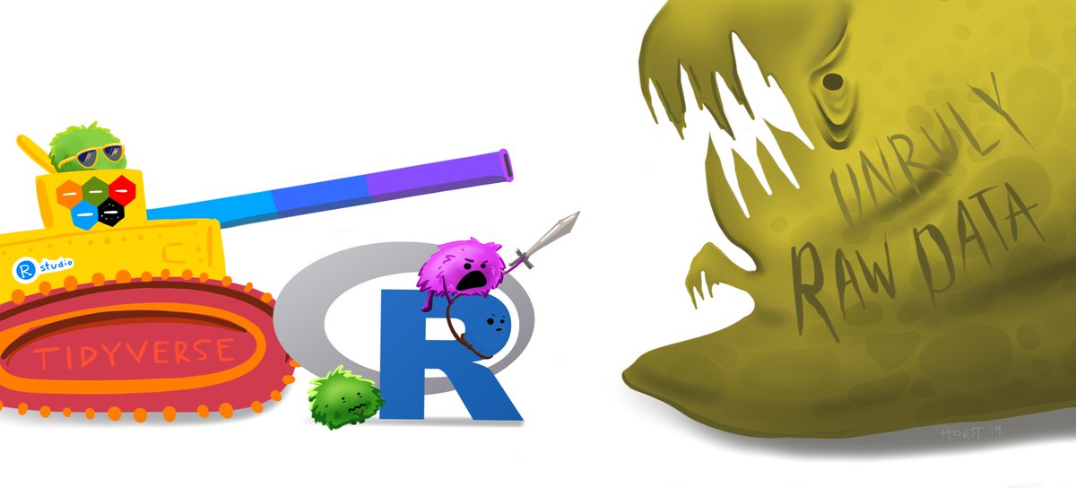
Up to now, we’ve been working with pretty tidy datasets. Every column is a variable, every row is an observation, and every value is where it should be. But things are not always this way. More often than you’re going to like, data comes to you an unruly mess, and you’ll need to tidy it up before you can even start to explore it.
 Over the next few weeks, we’ll
learn some of the most important functions in the
 tidyverse
for data wrangling.
Reading Assignments
Before next week, read up on:
- How to join information from two dataframes
together.
left_join()is the most useful. Here’s a good explanation, and here’s an interactive primer.1 - Healy Chapter 5
Team Project
Reproduce Figure 1.8 (or Figure 1.9, your choice) from Chapter 1 of the Healy book. You can ignore the shaded confidence interval, but add six countries not included in the original plot.2 Write a report in Quarto including your chart, and submit the report to eLC as a knitted PDF.