This week, we discuss how to work with datasets that include information from multiple time periods.
Example Code
Let’s look at the relationship between national income and life
expectancy in the gapminder dataset. Do people in wealthier
countries live longer on average?
# A tibble: 6 x 6
  country     continent  year lifeExp      pop gdpPercap
  <fct>       <fct>     <int>   <dbl>    <int>     <dbl>
1 Afghanistan Asia       1952    28.8  8425333      779.
2 Afghanistan Asia       1957    30.3  9240934      821.
3 Afghanistan Asia       1962    32.0 10267083      853.
4 Afghanistan Asia       1967    34.0 11537966      836.
5 Afghanistan Asia       1972    36.1 13079460      740.
6 Afghanistan Asia       1977    38.4 14880372      786.
Notice that the gapminder dataset has country-level data
on life expectancy, population, and GDP per capita every five years
between 2007 and 2007. So when you plot it all together, it looks like
this:
p <- ggplot(data = gapminder,
            mapping = aes(x = gdpPercap,
                          y = lifeExp,
                          color = continent,
                          size = pop)) +
  geom_point(alpha = 0.5) +
  scale_x_log10(labels = scales::dollar) +
  scale_size_continuous(labels = scales::comma,
                        breaks = c(1e5, 5e5,
                                   1e6, 5e6,
                                   5e7, 2e8,
                                   1e9)) +
  theme_minimal() +
  labs(x = 'GDP Per Capita',
       y = 'Life Expectancy',
       color = 'Continent',
       size = 'Population',
       title = 'The Health and Wealth of Nations')

p
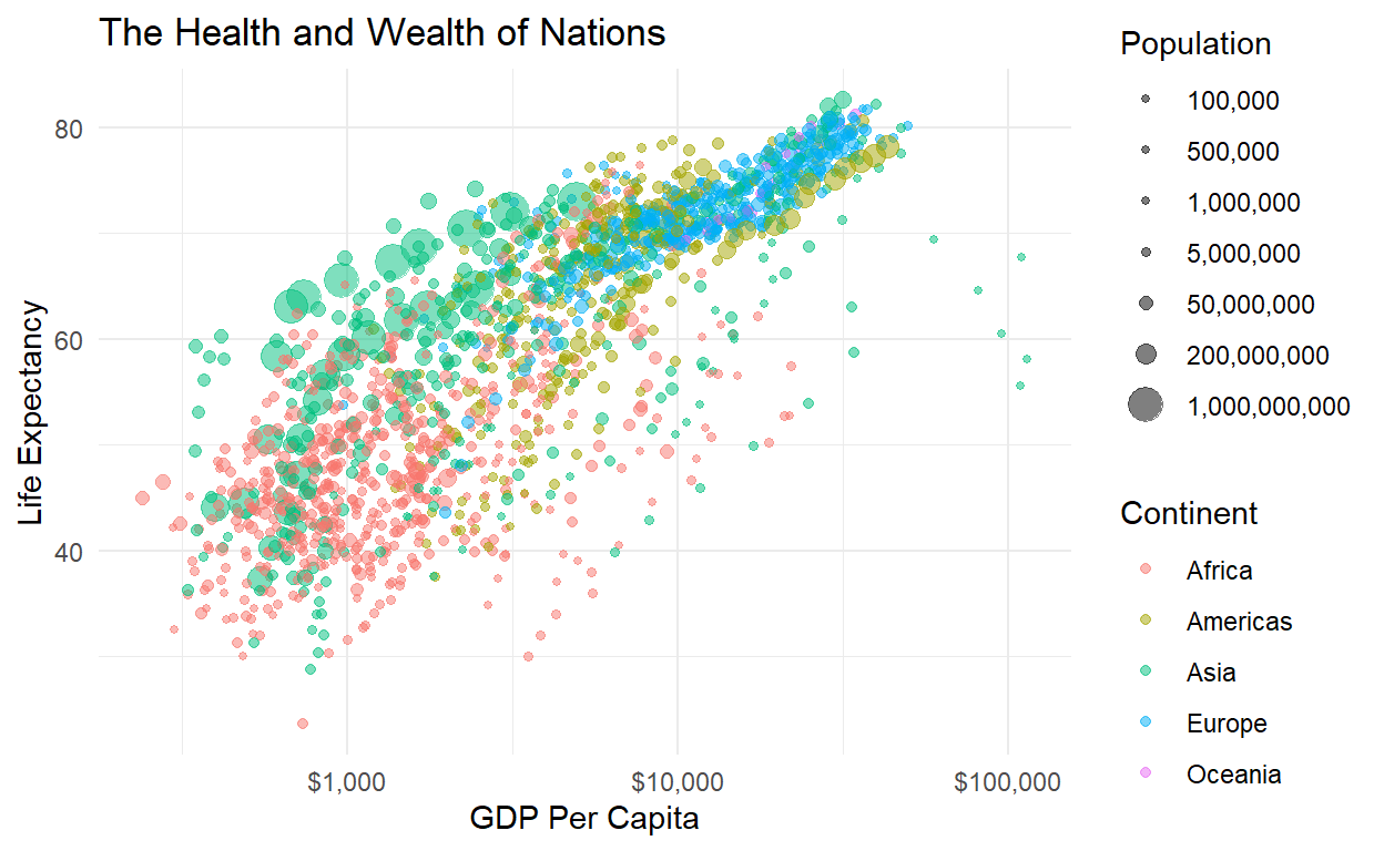
It looks like a strong relationship between wealth and health, but maybe it’s just that both GDP and life expectancy have been increasing over time, which causes a spurious correlation. Like plotting US margarine consumption and the divorce rates over time. To be sure we know what’s going on, we want to take a few precautions.
Solution 1: Look at Cross-Sections
Instead of plotting all the data at once, just filter out a single year and see if there’s a relationship. This is called taking a cross-section.
ggplot(data = filter(gapminder, year == 2007),
            mapping = aes(x = gdpPercap,
                          y = lifeExp,
                          color = continent,
                          size = pop)) +
  geom_point(alpha = 0.5) +
  scale_x_log10(labels = scales::dollar) +
  scale_size_continuous(labels = scales::comma,
                        breaks = c(1e5, 5e5,
                                   1e6, 5e6,
                                   5e7, 2e8,
                                   1e9)) +
  theme_minimal() +
  labs(x = 'GDP Per Capita',
       y = 'Life Expectancy',
       color = 'Continent',
       size = 'Population',
       title = 'The Health and Wealth of Nations (2007)')
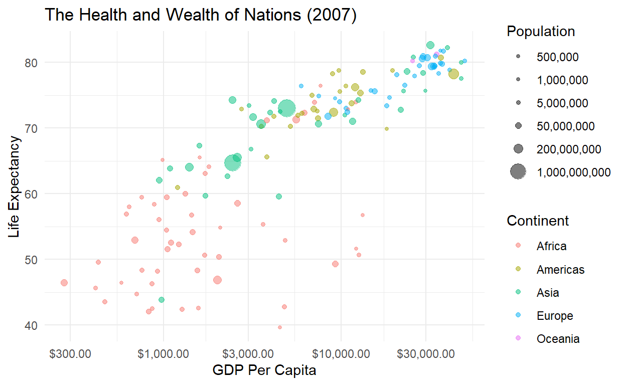
Still a relationship!
Solution 2: Look at a time series
Instead of looking at all the countries at once, let’s isolate a
single country and see what’s happening to its GDP and life expectancy
over time. The geom_path() layer connects points based on
their order in the dataset (rather than their order on the x-axis like
geom_line()).
ggplot(data = filter(gapminder, country == 'Poland'),
            mapping = aes(x = gdpPercap,
                          y = lifeExp,
                          label = year)) +
  geom_text() +
  geom_path() +
  scale_x_log10(labels = scales::dollar) +
  scale_size_continuous(labels = scales::comma,
                        breaks = c(1e5, 5e5,
                                   1e6, 5e6,
                                   5e7, 2e8,
                                   1e9)) +
  theme_minimal() +
  labs(x = 'GDP Per Capita',
       y = 'Life Expectancy',
       color = 'Continent',
       size = 'Population',
       title = 'The Health and Wealth of Poland')

Solution 3: Make a movie!
Why just look at a cross-section or a time series, when you
can do both simultaneously? Take that original plot object
p and make the dots move over time:
library(gganimate)

p + transition_time(time = year)
Now we can see the trajectory of individual countries over time (check out China - the big one!) and verify that the relationship between health and wealth is positive from the 1950s all the way to today.
Reading Assignments
Next week, text as data! The following tutorial is your guide to the
tidytext package, and make you’ve completed the
instructions to sign up for the Twitter
API.
Team Project
Create an animation of a time series dataset. Post the replication code to eLC.