Reading
- Teacup Giraffes, The Normal Distribution
- Healy Chapter 3
- Healy Chapter 4
- Healy Chapter 5
- Read up on how to join information from two dataframes together.
left_join()is the most useful. Here’s a good explanation, and here’s an interactive primer.
Optional
- Healy Chapter 1: A nice review of the evidence on what makes an effective visualization.
- If you want to learn how to make maps in
ggplot, Healy Chapter 7 is a great resource. - For more practice with
ggplot, this chapter in Hadley Wickham’s book is a nice resource.1 - The ggplot cheat sheet is a useful reference.
Overview
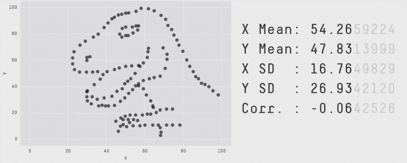
The brain is hardwired to detect patterns in images, and a well-crafted data visualization can take advantage of that fact to communicate lots of information in an aesthetically pleasing way. And it’s about more than communication. Charts can reveal patterns in data that summary statistics alone might miss, as the Datasaurus Dozen artfully reveals…
This week, we get deeper into building visualizations with the ggplot2 package (a part of the tidyverse). It will take some time to learn all of the function syntax, so be patient with yourself. Once you get the hang of it, you’ll have an endlessly flexible tool for exploring and communicating patterns in your data. Let’s get started.
Problem Set
Using one of the datasets we’ve been working with in class, submit a data visualization using ggplot. Your submission should:
- Communicate some interesting result
- Use more than one aesthetic
- Be easy to interpret at a glance (you can include a short caption –
labs(caption = ...)– if you would like). - Be reproducible; submit your figure as a
.pngfile, plus the.Rscript that produced it.
Consider this a friendly competition! I will look through the sumbmissions and pick my favorites, and their creators will receive honor, glory, and adoration.
Hadley is the author of
ggplot, so he knows a trick or two.↩︎