Readings
Kellstedt and Whitten (2018), chapters 7-8 (Statistical Inference and Bivariate Hypothesis Testing)1
Huntington-Klein (2021), section 3.5 (this is the section we skipped before on Theoretical Distributions).
There Is Only One Test (blog post by Allen Downey)
Overview
Last week, we introduced probability theory from the perspective of sampling. We have some population of interest, and we imagine all the possible samples that we could draw from the population. With this sampling distribution in hand, we have a better sense of how far from the truth a sample estimate might be.
This week, we turn that question on its head. We are no longer an omniscient being who can sample ad infinitum from the population. Instead, we are a humble researcher with a single sample. What conclusions can we draw? How confident are we that our sample is not way out in the tails of the sampling distribution? That is a task for statistical inference.
Class Notes
Every statistic has a sampling distribution. When we conduct a hypothesis test, we compare our observed statistic to its sampling distribution, to assess whether that statistic is something we would have expected due to chance alone. Every hypothesis test proceeds in three steps:
Compute the test statistic
Generate the sampling distribution assuming a null hypothesis
Compare the test statistic with its sampling distribution. This comparison will take one of two forms:
A p-value (if the null hypothesis were true, how surprising would my test statistic be?)
A confidence interval (what is the set of null hypotheses for which my test statistic would not be surprising?)
Step 1: Compute the test statistic
A statistic can be anything you compute from data! So far we’ve computed statistics like:
The sample mean2
The difference in means
Variance
Linear model coefficients
A word on notation: statisticians denote population-level parameters with Greek letters.3 So the population mean is typically \(\mu\), the population standard deviation is \(\sigma\), the true average treatment effect is \(\tau\), and the true linear model slope coefficient is \(\beta\). Of course, you can write whatever Greek letters you like. These are just conventions.
Sample statistics get plain old English letters, like \(b\) for an estimated slope or \(s\) for a the standard deviation of a sample. Alternatively, they might get little hats on top of Greek letters, like \(\hat{\beta}\), to show that they are estimates of the population-level parameter we care about.
As a running example, let’s draw a sample from CES and compute the difference in support for tariffs on Chinese goods between men and women.
load('data/ces-2020/cleaned-CES.RData')

sample_data <- ces %>%
  filter(!is.na(china_tariffs)) %>%
  mutate(pro_tariff = as.numeric(china_tariffs == 'Support'),
         female = as.numeric(gender == 'Female')) %>%
  slice_sample(n = 100)

linear_model <- lm(pro_tariff ~ female,
                   data = sample_data)

test_statistic <- linear_model$coefficients['female']

test_statistic
female
0.01550388 Our sample estimate (\(\hat{\beta}\)) suggests that women are 1.55 percentage points more likely than men to support tariffs on China. Is that difference “real” or could it have been driven just by sampling variability? Let’s find out.
Step 2: Derive the Sampling Distribution
Statisticians have spent centuries doing most of the work here, so unless you’ve computed a statistic nobody’s ever seen before, chances are you won’t have to do too much heavy lifting. As we demonstrated in the problem set, the sampling distribution of a difference-in-means statistic is normally distributed, so let’s work with that.
We typically represent random events (like the outcomes of a random sample) with a special type of function called a probability distribution function (pdf). These functions have two special properties:
- \(f(x) \geq 0\)
- \(\int_{-\infty}^\infty f(x)dx = 1\)
That first property says that probability can’t be less-than-zero. Every outcome must have at least a zero probability of happening. The second property uses integral notation (if you’ve never seen that before we’ll discuss it in a moment). It says that the sum of probabilities for all outcomes equals 1 (something has to happen).
The PDF of a normal distribution looks like this (please don’t cry).
\[ f(x) = \frac{1}{\sigma \sqrt{2\pi}} e^{-\frac{1}{2}\left(\frac{x-\mu}{\sigma}\right)^2} \]
where \(\mu\) is the mean of the distribution, \(\sigma\) is the standard deviation, \(\pi\) is the ratio of a circle’s circumference to its diameter, and \(e\) is how much money you would have if you left a dollar in a bank offering 100% interest continuously compounded over one year. The fact that both \(\pi\) and \(e\) appear in the same equation to describe the distribution of a sample mean is honestly one of the most beautiful things I know about the universe.4
We’d like to test the null hypothesis that there is no difference between men and women on support for tariffs \((H_0: \beta = 0)\). So we’ll set the mean of our null distribution to 0, but what do we use for \(\sigma\)? We don’t know its true value, because we only have a sample. So we’ll estimate it instead.
Recall from the Kellstedt and Whitten (2018) that the standard error of a difference in means statistic is \(\sqrt{\frac{\sigma^2}{n_0} + \frac{\sigma^2}{n_1}}\). (If you’re curious where that value comes from, see the appendix of this page.) We’ll estimate that standard error by plugging in the sample variance for \(\sigma^2\).
n0 <- sum(sample_data$female == 0)
n1 <- sum(sample_data$female == 1)
s <- sd(sample_data$pro_tariff)
standard_error <- sqrt(s^2 / n0 + s^2 / n1)

standard_error
[1] 0.09616614Which means that if the null hypothesis were true, the sampling distribution would look like this:
x <- seq(-0.5, 0.5, 0.001)
f <- dnorm(x, mean = 0, sd = standard_error)

ggplot() +
  geom_line(mapping = aes(x=x, y=f)) +
  theme_minimal()
…which should look a lot like the sampling distribution from your last problem set!
load('data/ces-2020/ps11-sampling-distribution.RData')

ggplot() +
  geom_histogram(mapping =
                   aes(x=sampling_distribution,
                       y = ..density..),
                 color = 'black', fill = 'gray',
                 binwidth=0.02) +
  geom_line(mapping = aes(x=x, y=f),
            color = 'red') +
  theme_minimal()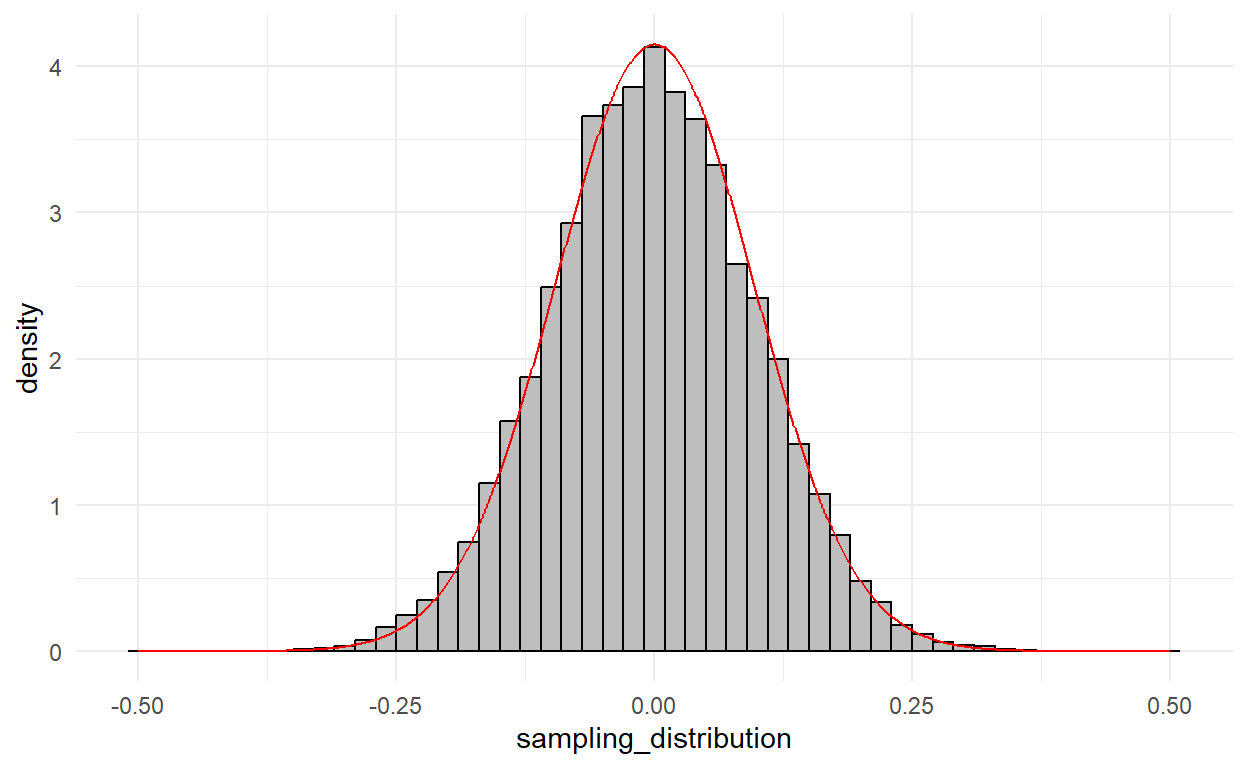
Step 3: Compare the observed statistic to the null distribution
There are two ways to do this:
- Compute the probability that you’d observe a statistic as extreme as you did if the null hypothesis were true (p-value)
- Construct an interval such that in 95% of samples, it would include the truth (confidence interval).
To understand where p-values come from, let’s take a quick break for second-semester calculus:
Okay we’re back.
Formally, our sample statistic is \(\hat{\tau}\). The sampling distribution of this statistic is centered around the true population parameter \(\tau\).
\[\hat{\tau} \sim \mathcal{N}\left(\tau, \frac{\sigma^2}{n_0} + \frac{\sigma^2}{n_1}\right)\]
If \(\tau = 0\), what is the chance we would observe a sample statistic as large as we did?

And the p-value is equal to that shaded area.
\[p = \int_{-\infty}^{-\hat{\tau}} \mathcal{N}\left(0, \frac{\sigma^2}{n_0} + \frac{\sigma^2}{n_1}\right) + \int_{\hat{\tau}}^\infty \mathcal{N}\left(0, \frac{\sigma^2}{n_0} + \frac{\sigma^2}{n_1}\right)\]
We can compute that quantity in R with the pnorm() function.
p <- pnorm(-test_statistic,
           mean = 0,
           sd = standard_error,
           lower.tail = TRUE) +
  pnorm(test_statistic,
        mean = 0,
        sd = standard_error,
        lower.tail = FALSE)

p
female
0.8719204 Appendix
To see why the standard error of the difference-in-means statistic is equal to \(\sqrt{\frac{\sigma^2}{n_0} + \frac{\sigma^2}{n_1}}\), first recall that the variance of one sample mean is \(Var(\bar{X}) = \frac{\sigma^2}{N}\). Now we draw two independent sample means and take the difference. What’s the variance of that statistic?
\[ Var(\bar{X_1} - \bar{X_0}) = Var(\bar{X_1}) + Var(\bar{X_0}) - 2 Cov(\bar{X_1},\bar{X_0}) \]
Because the two samples are drawn independently, that final covariance term equals zero. The standard error is the square root of the variance, so:
\[ \sqrt{Var(\bar{X}_1) + Var(\bar{X}_2)} = \sqrt{\frac{\sigma^2}{n_0} + \frac{\sigma^2}{n_1}} \]
If you’re taking POLS 7010, then I assume you have this book. If not, you may borrow it from others in the class or from me. Or buy it, I guess. It’s a good book.↩︎
The reason why statisticians like means as a measure of central tendency is because of Central Limit Theorem! The sampling distribution of the mean is normally distributed; no such guarantee for other statistics like medians or modes.↩︎
Because mathematicians associate timeless truth and beauty with the ancient Greeks.↩︎
And that’s saying something, because I recently learned about sugar gliders.↩︎