Reading
- The Joy of X, Chapters 17 and 18.
- Moore & Siegel, Chapter 5.
- The Effect, Chapter 4 (Describing Relationships)
- Allison Horst Explains Derivatives.
Overview
This week, we introduce the linear model, the workhorse of empirical social science. In its most basic form, we take two variables from our dataset and try to find the “line of best fit” – the line that best describes the relationship between them. For example, the line of best fit below suggests that places where infant mortality is high also tend to be places where fertility is high, and vice versa:
ggplot(data = swiss,
       mapping = aes(x = Fertility,
                     y = Infant.Mortality)) +
  geom_point() +
  # the line of best fit
  geom_smooth(method = 'lm', se = FALSE) +
  theme_bw() +
  labs(title = 'The Relationship Between Fertility and Infant Mortality',
       subtitle = 'Swiss Provinces (1888)')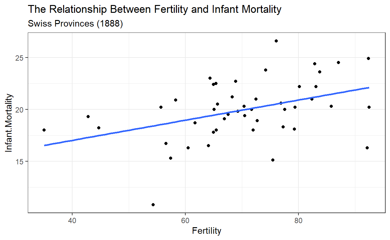
But where did that line of best fit come from? What does it even mean to be the “best fit”? To answer that question, we first need a language that will help us talk about how to minimize error or maximize model fit. That language is differential calculus.

Come with me on a journey.
Slides
Problem Set
For the midterm mini-conference next week, please prepare a 10 minute presentation about a dataset you find interesting (feel free to use one of the datasets we’ve looked at in class, or strike out on your own). Your presentation should describe each step in your analysis pipeline: importing, tidying, summarizing, and visualizing. Submit the code you used in your analysis to eLC (both the R script and a PDF report from the script).
Please send me the title of your presentation at least two days in advance so I can create the mini-conference program.