Confidence Intervals
Previously, we introduced the p-value, the probability of observing a value as extreme as your test statistic if the null hypothesis were true. A complementary concept is the confidence interval, which is a way to express the range of values that is consistent with your observed statistic. A 95% confidence interval, for example, is a set of values such that, in 95% of random samples, it will contain the true value.
You can construct a 95% confidence interval by taking your sample estimate plus and minus 2 standard errors.1 If the sampling distribution is normal, then about 95% of the time that confidence interval will contain the true population parameter.
To illustrate, let’s draw samples from CES and compute 95% confidence intervals for average age. The true average age is:
Let’s draw a sample and compute a confidence interval.
sample_size <- 100

sample_ages <- ces |>
  slice_sample(n = sample_size) |>
  pull(age)

estimate <- mean(sample_ages)

estimate
[1] 45.89standard_error <- sd(sample_ages) / sqrt(sample_size)
confidence_interval <- c(estimate - 1.96 * standard_error,
estimate + 1.96 * standard_error)
confidence_interval[1] 42.3209 49.4591In class, we’ll do this a bunch of times, and see that the confidence interval captures the truth 95% of the time!
A Wrinkle: T-Tests
Up to now, we’ve been working with sample sizes that are large enough for their sampling distribution to be approximately normal. But the central limit theorem doesn’t hold unless there is a sufficiently large number of observations!
How small is too small? Well, try computing those confidence intervals again, but with a sample size of 10.
sample_size <- 10

sample_ages <- ces |>
  slice_sample(n = sample_size) |>
  pull(age)

estimate <- mean(sample_ages)

estimate
[1] 44.3standard_error <- sd(sample_ages) / sqrt(sample_size)
confidence_interval <- c(estimate - 1.96 * standard_error,
estimate + 1.96 * standard_error)
confidence_interval[1] 30.65159 57.94841If you repeat that enough times, you’ll see that the 95% confidence interval only contains the truth about 91% of the time. Our statistical test falls apart with small samples!
William Sealy Gosset came across this problem while working at the Guinness Brewery in the early 1900s, conducting experiments to find the best variety of barley. Working with samples too small to rely on normal approximations, he developed what we now call the Student’s t test. 2
It goes like this. Instead of computing a statistic like the sample mean or difference-in-means, the researcher instead computes a t-statistic.
\[ t = \frac{\text{statistic} - H_0}{\text{standard error}} \]
Essentially, the \(t\) statistic tells you how many standard errors your observed statistic is from the null hypothesis. Gosset showed that the sampling distribution for this statistic follows a Student’s t distribution.
To demonstrate what that looks like, let’s draw a bunch of samples from CES, compute the \(t\) statistic for the age of each sample, and see what the sampling distribution of that \(t\) statistic looks like:
# the true average age in the population
mu <- mean(ces$age)

# this function draws a sample of ages and computes the t statistic (how many standard errors away from the truth is the sample mean?)
get_t_statistic <- function(n = 10){

  # draw the sample
  sample_ages <- ces$age[ sample(1:nrow(ces), size = n) ]

  # xbar is the sample mean
  xbar <- mean(sample_ages)

  # s is the sample standard deviation
  s <- sd(sample_ages)

  # return the t statistic
  (xbar - mu) / (s / sqrt(n))

}

# generate a sampling distribution with n=10
sample_size <- 10
sampling_distribution <- replicate(25000,
                                   get_t_statistic(n = sample_size))

p <- ggplot() +
  geom_histogram(mapping = aes(x=sampling_distribution,
                               y=..density..),
                 binwidth = 0.15,
                 color = 'black')
p
That sampling distribution looks like a bell curve, but let’s overlay a normal distribution…
# overlay normal distribution
expected_value <- mean(sampling_distribution)
standard_error <- sd(sampling_distribution)

x <- seq(min(sampling_distribution),
         max(sampling_distribution),
         0.01)
f_norm <- dnorm(x, mean = expected_value,
                sd = standard_error)

p <- p +
  geom_line(mapping = aes(x=x, y=f_norm),
            color = 'red')

p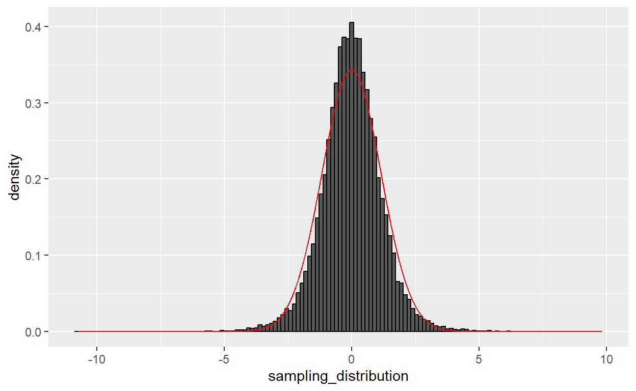
The normal distribution is all wrong! It’s not peaky enough, and there are a bunch of outliers that the normal distribution doesn’t expect. Now let’s overlay a Student’s \(t\) distribution with the dt() function…
# overlay a Student's t distribution
x <- seq(min(sampling_distribution),
         max(sampling_distribution),
         0.01)
f_t <- dt(x, df = sample_size - 1)

p <- p +
  geom_line(mapping = aes(x=x, y=f_t),
            color = 'blue')

p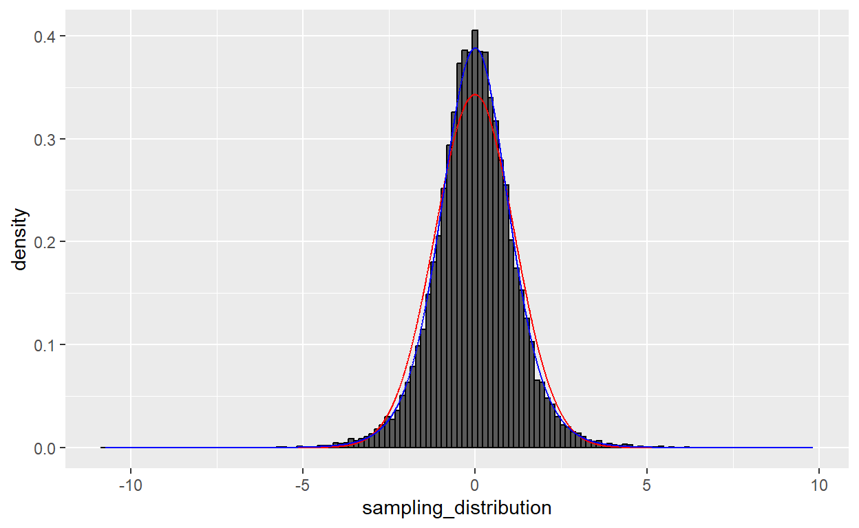
Much better.
Note that this distinction between the t distribution and the normal distribution only really matters when sample size is small. If we go back to drawing a sample of 100…
# generate a sampling distribution with n=100
sample_size <- 100
sampling_distribution <- replicate(25000,
                                   get_t_statistic(n = sample_size))

p <- ggplot() +
  geom_histogram(mapping = aes(x=sampling_distribution,
                               y=..density..),
                 binwidth = 0.15,
                 color = 'black')

# overlay normal distribution
expected_value <- mean(sampling_distribution)
standard_error <- sd(sampling_distribution)

x <- seq(min(sampling_distribution),
         max(sampling_distribution),
         0.01)
f_norm <- dnorm(x, mean = expected_value,
                sd = standard_error)

p <- p +
  geom_line(mapping = aes(x=x, y=f_norm),
            color = 'red')

# overlay a Student's t distribution
x <- seq(min(sampling_distribution),
         max(sampling_distribution),
         0.01)
f_t <- dt(x, df = sample_size - 1)

p <- p +
  geom_line(mapping = aes(x=x, y=f_t),
            color = 'blue')

p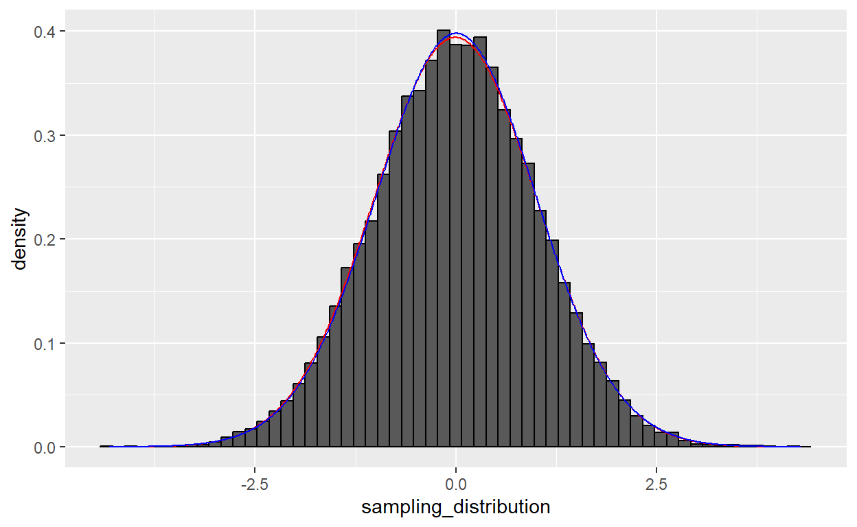
…both distributions are essentially identical. But researchers tend to default to a t-test, because it works no matter what your sample size is.
Some Points of Caution
Let’s close our discussion of hypothesis testing with some notes of caution. P-values, confidence intervals, and “statistical significance” are widely misused, abused, and misunderstood. It’s worth taking a moment to consider what these tests can and cannot tell us.
1. P-values and confidence intervals don’t mean what most people think they mean
When discussing the results of a hypothesis test, it is common even for knowledgeable researchers to slip into colloquial language, like “the p-value is 0.03, which means there’s a 3% chance that the null hypothesis is true”. Or “I’m 95% sure that the true value lies within this confidence interval”. These interpretations seem sensible, but they’re wrong in an important-to-understand way.
A p-value tells us the probability of the observing your statistic, conditional on the null hypothesis being true. But that’s a bit of a bait-and-switch, because it’s not really the thing we want to know. Instead, we we want to know the probability the null hypothesis is true, conditional on observing the statistic you did. Fortunately, Bayes Theorem tells us how to go from one conditional probability to the other.
\[ P(H_0 | \text{statistic}) = \frac{P(\text{statistic}|H_0) \times P(H_0)}{P(\text{statistic})} \]
The first term, \(P(\text{statistic}|H_0)\), is your p-value. The second term, \(P(H_0)\), is your prior, how likely you think the null hypothesis is before you even look at your data. The third term, \(P(\text{statistic})\) turns out to be surprisingly difficult to compute, which is why Bayesian statistics didn’t really take off until we got really powerful personal computers.3 The key takeaway is that not all p-values are created equal. A small p-value in favor of a dodgy hypothesis can still be considered weak evidence.
2. Dividing results into “significant” and “not significant” is silly
Humans crave certainty, but a p-value alone cannot give us the certainty we crave. It cannot tell us whether our result is “real” or not. So over the past century, the scientific community has developed a convention of dividing results into “statistically significant” and “not statistically significant” based on whether the p-value in a null hypothesis test is less than 0.05 – that is, if the chance of the null hypothesis producing our result is less than five percent.4
But this convention is silly at best, harmful at worst. Silly because there’s no meaningful sense in which a study with p=0.049 is “significant” but a study with p=0.051 is “insignificant”. Imposing an arbitrary threshold does not add clarity to the research prcess, and when combined with publication bias – the tendency of journals to only publish statistically significant results – the practice only serves to distort the published literature with wildly exaggerated claims. Gelman and Carlin (2014) call this “Type M error” and it works like this:
Suppose 200 researchers each survey a random sample of 100 Americans to see if people who use social media are more likely to support an assault rifle ban. Their study only gets published if their p-value is less than 0.05.
load( here('data/ces-2020/cleaned-CES.RData') )

# clean up the data
ces <- ces |>
  select(social_media_24h, assault_rifle_ban) |>
  # remove rows with missing data
  na.omit() |>
  # convert to 0-1
  mutate(social_media_24h = as.numeric(social_media_24h == 'Yes'),
         assault_rifle_ban = as.numeric(assault_rifle_ban == 'Support'))

# the true difference in the population
ces |>
  group_by(social_media_24h) |>
  summarize(pct_support_ban = mean(assault_rifle_ban))
# A tibble: 2 × 2
social_media_24h pct_support_ban
<dbl> <dbl>
1 0 0.641
2 1 0.644The true difference is basically zero; social media users are 0.3% more likely to support an assault rifle ban. But our 200 scientists get results all over the map:
results <- replicate(200,
                     ces |>
                       slice_sample(n = 100) |>
                       lm(assault_rifle_ban ~ social_media_24h, data = _) |>
                       coef() |>
                       last())

p <- ggplot(mapping = aes(x=results)) +
  geom_histogram(color = 'black') +
  theme_minimal() +
  labs(x='Estimate',
       y = 'Number of Studies')

p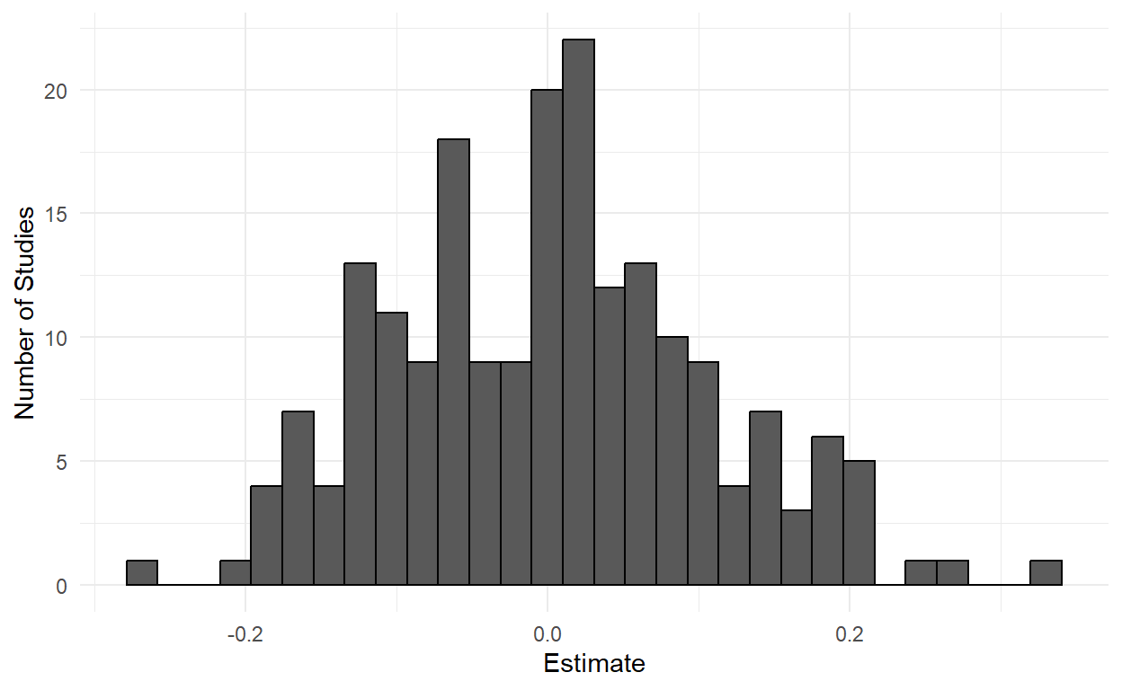
The standard error of the difference-in-means estimator is roughly 0.1, so any estimate greater than 0.2 or less than -0.2 will be deemed “statistically significant” and published. And we’ll have roughly five studies saying that social media makes you 20% more liberal, and five studies saying that social media makes you 20% more conservative.
This example is somewhat contrived, but the replication crisis in psychology (Button et al. 2013; Loken and Gelman 2017) has highlighted how small sample sizes and a statistical significance requirement for publication have resulted in a literature littered with extreme claims that fail to replicate.
To make matters worse, Hauer (2004) describes how the dominance of statistical significance testing has imposed enormous costs when applied life-and-death questions like “does increasing speed limits cause more auto fatalities?”:
The problem is clear. Researchers obtain real data which, while noisy, time and again point in a certain direction. However, instead of saying: “here is my estimate of the safety effect, here is its precision, and this is how what I found relates to previous findings”, the data is processed by NHST, and the researcher says, correctly but pointlessly: “I cannot be sure that the safety effect is not zero”. Occasionally, the researcher adds, this time incorrectly and unjustifiably, a statement to the effect that: “since the result is not statistically significant, it is best to assume the safety effect to be zero”. In this manner, good data are drained of real content, the direction of empirical conclusions reversed, and ordinary human and scientific reasoning is turned on its head for the sake of a venerable ritual.
Many scientists think the problem is that 0.05 is too high a threshold, and advocate using something like 0.005 instead (Benjamin et al. 2018). With respect to the 72 authors of that paper I just cited (many of whom I deeply admire), my own preference is to abandon statistical significance rather than redefine it. Reducing the threshold to 0.005 solves neither the harms discussed by Hauer (2004) nor the Type M distortions discussed by Gelman and Carlin (2014). Those can only be solved by research transparency and human judgment.
3. “Big Data” can be wildly misleading
In November 2022, Elon Musk conducted the following Twitter poll.

With over 15 million votes, the poll estimated that 51.8% of Twitter users wanted Trump back on the platform. Let’s put a 95% confidence interval around that estimate.
# a bit over 15 million respondents
n <- 15085458

# here's that poll as a vector
poll <- c(
  rep(1, n * 0.518),
  rep(0, n * 0.482)
)


# approximately normal sampling distribution,
# mean = 51.8
# standard error = sd / sqrt(n)
estimate <- mean(poll)
sd <- sd(poll)
se <- sd / sqrt(n)

# the 95% confidence interval is plus/minus 1.96 standard errors
confidence_interval <- c(
  estimate - 1.96*se,
  estimate + 1.96*se
)

confidence_interval
[1] 0.5177479 0.5182522Our 95% confidence interval ranges from 51.77% to 51.83%. By the standards of the data we’ve been working with in class, this is an incredibly precise estimate! With giant sample sizes come teeny tiny standard errors.
But, what does that actually mean? Does it mean we’re 95% confident that somewhere between 51.77% and 51.83% of Twitter users support reinstating Donald Trump?
Here’s where insisting on the pedantic definition of confidence intervals really starts to come in handy. A confidence interval doesn’t say “I’m 95% confident the value is in here”. It says “if we draw a bunch of random samples from the population, then the confidence interval will contain the true value 95% of the time”. But there’s no reason to believe that Musk’s poll is a random sample. Certain people were more likely than others to see and respond to the poll, and it’s unlikely that the people who responded are perfectly representative of the population of Twitter users.
What inferences can we make about the population using this sample? The surprising answer is…basically nothing! Because we have no way of knowing whether Trump supporters were more or less likely to answer Musk’s poll (and by how much), even a sample size as large as 15 million doesn’t permit us to make valid inferences beyond the sample. In fact, a truly random sample of 1,000 Twitter users would do a much better job estimating what the broader population thinks than this non-representative poll of 15 million.
The key takeaway here is that data quality matters far more than data quantity. For more on this “Big Data Paradox”, I highly recommend the Bradley et al. (2021) paper on how surveys of millions of social media users wildly mis-estimated the COVID-19 vaccination rate, while a carefully-constructed random sample of 1,000 performed much better. For a more technical (but still delightful) description of the trouble with Big Data, see Meng (2018).
Again, technically 1.96 standard errors, but 2 standard errors is a useful shorthand.↩︎
Gosset published his results under the pseudonym “Student”, because his employer did not want other breweries to catch on and start using t-tests.↩︎
If all this intrigues you, may I suggest reading my favorite statistics book of all time – Statistical Rethinking (McElreath 2020)? I considered assigning it for this class, but honestly you need to have first thought about statistics before you can benefit from rethinking about statistics.↩︎
Remarkably, the entire edifice of p < 0.05 denoting “statistical significance” is drawn from an offhand comment Ronald Fisher wrote on page 45 of Statistical Methods for Research Workers (Fisher 1925), calling it “convenient”.↩︎